Cassette
Cassette is an application for cyclist lovers and bicyclists alike!
The Users can begin to log, track, and get notified when they need to start maintenance on their bikes based on AI recommendations.
Timeline: 4 weeks
Role: end-to-end UX/UI designer
The Problem
Bikes of all shapes and sizes are an investment!
Lots of hardcore cyclists are already on a tight schedule with their bike shop of choice when trying to maintenance their bike and keep it at 100% health to ensure they’re getting the most performance out of their bike.
Target Group
Gender: Any
Age: 25-40
Lifestyle: Active
Already owns some type of bicycle
Actively uses their bike 1-2 times a month
The Solution
With this application, we can bring the rigorous maintenance schedule and tedious grunt work of making sure your equipment is up to date to regular consumers of cycling while understanding the needs, expectations and the overall achievable goals of the end user in this product.
Business Goals
Bring in as many users as possible into the app
Bring in as many vendors or bike shops as possible to make sure the market is taken care
Make sure to turn a profit off every maintenance scheduled through the app (take a percentage of sales from the shop)
Generate a stream of venue from the bike groups as they must pay to post or pay to own an organization on the app (this has upsides for the vendors/group
User Goals
Make scheduling maintenance easier than calling or in-person
Make seeing what parts are worn or need replacement to be accurate and happen within a timely manner
Build trust with the app and make it feel like the maintenance is worth the app
Competitor Analysis
Main competitors:
SWOT Analysis:
Strengths:
Seems like its the only UK brand
Notifications, tracking components dev team
Subscription model
Tracking based on real data from Strava
Weaknesses:
Opportunities:
Their overall branding
Their UI seems outdated
Updating their UI
Small team most likely
Making their business a subscription model
they are using the most mileage tracker (strava)
A way to inject more features into their product
Threats:
a complete UI redesign
Successful Competitors:
maintrack
hubtiger
Strengths:
US brand
They have more features listed above
Their website UI is very solid, feature-friendly and heavily pointed toward the end user
Weaknesses:
Opportunities:
The app UI itself seems clunky itself
There’s a definite lack of features overall
Very barebones app
Their core set of features and tools are a great base to build off of
Threats:
a complete UI redesign
Successful Competitors:
hubtiger
Strengths:
a dual business model for shops and customers
Usage & Maintenance Tracking
Service And Fitting Bookings
Group Rides
Integrated communication
selling software for multiple types of bikes to shop
UI and feature set
Weaknesses:
Opportunities:
Overall I found that Hubtiger was doing what exactly users needed from both the consumer end and the business end when it comes to selling their product B2C and B2B
Their UI style has kept up with what users expect out of newer applications
Threats:
a complete UI redesign
Successful Competitors:
Maintrack
Id like to explore a better way to navigate bike maintenance that focuses more on empowering the user in making the decision when parts should be maintained in the correct time period and also include doing at home maintenance when possible.
How might we empower the user to correctly identify when a part on their bike can be maintenance/needs to be maintenance either from the comfort of their own home or at their local shop?
3 Main Questions & Problem Statements
Id like to explore a better way of connecting cyclists using one app by breaking barriers of different social media outlets and utilizing one app to bridge the internet-real life gap.
How might we connect different types of riders together on one platform and bridge the internet-real life gap?
I’d like a way to keep all cyclists safe in utilizing a tool that’ll help them make better-informed decisions about their own bikes.
How might we keep cyclists safe by alerting them to maintenance issues on their bike?
The Research
Interviews
12 people were interviewed, all genders were represented equally.
All interviews took place online via zoom & via surveys sent out.
I posted on instagram the survey link along with further information to people that wanted to be interviewed more intensely for this project.
Insights
0 participants don’t currently use a bike maintenance app
Most participants would sometimes use a BMA (Bike Maintenance App)
Almost half the participants said they would use a BMA if it connected to Strava (A mileage tracker app)
90% of participants would use an app if it had parts-maintenance tracking
95% of participants would use a BMA if it had a group ride track or social aspect
Over 50% of participants would follow the guidance of the BM app
Affinity Map
Sitemap
User Flow
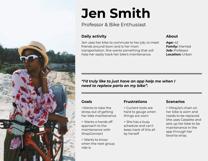
Personas
Low Fidelity Wireframes
Mid-Fidelity Wireframes
The R&D
Moodboard
Brand Style Tile & Logo
High Fidelity Wireframes
Usability Testing
I reached out to 5 participants from the first batch of research & asked them to test these four flows:
Create an account
Register your bike with the app
Adding a new bike part to their tracker
Find your local shop and book an appointment
Feedback
Create an account
All participants could successfully create a new account entering their info
They passed through each frame without any reported issues
Register your bike with the app
Each participant could successfully find their bike in the system and register it.
Most users had to search in the bar for their bike and wasn’t found in the suggested “bikes” section.
Users did state they wish there was a quicker UI fix for this issue rather than having suggested bikes they could easily just search.
Adding a new bike part to their tracker
Most participants did not struggle to add a new part into the tracker
Some participants wished they could scan a barcode or some type of interaction with the part to register it.
Find your local shop and book an appointment
Most participants (based in Atlanta) could successfully register their accounts and bike to their local shop.
This feedback from users about their local shop could potentially effect the B2B side of the application for the future in terms of how shops and customers want their feedback and progress updated on both sides.
Final Result based on the feedback
Thoughts on design:
With increasing the text font, adding some nuances to the design, and making sure the application is useable I wanted to make sure the features were pointed and could be used thoroughly.
Key Takeaways
What I would have done differently:
This project had many features that had to be implemented to be approved as a full-fledged application. If I had more time with this project I would have gone deeper into fleshing out the features I wanted to see more of like part tracking and explaining the rational and data from what I gathered. I think allocating more time to this project could have helped me achieve those goals.
Personal Aspect:
This project really challenged my time management skills, my design thinking, and how we can use tools and applications in current circulation to better utilize a new product like my app!
Stakeholder Management:
This project did challenge my stakeholder management with current and new features that could be implemented. When talking it over with my mentor we went back and forth with how exactly I could implement certain features that would be beneficial to stakeholders and provide a better overall user experience without pushback from stakeholders.


